Overview
In preparation of the new TurF activewear launch, it was a perfect time to revisit and refine TurF’s brand guidelines. Established 7 years prior, the founders wanted a bolder colour palette and assets to ensure the in-house marketing team had a fresh set of tools and graphics to promote the new line and reflect a more energetic approach online and in social.
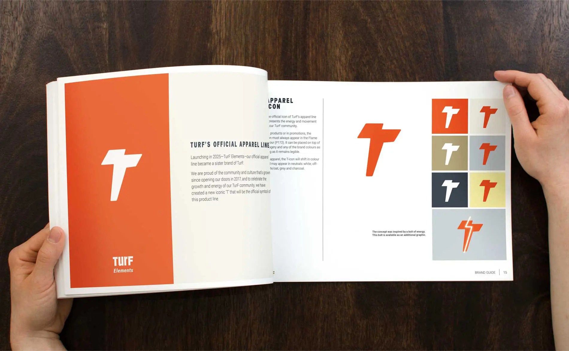
A key element of the project was to reimagine one of the existing original elements, a T icon, so it could live on the clothing as its own unique mark but still be connected to the TurF family. We suggested a fresh approach — to craft a stronger and more active T to better reflect the purpose of the product line — movement — while also ensuring it would hold up to the many potential methods and sizes of reproduction.
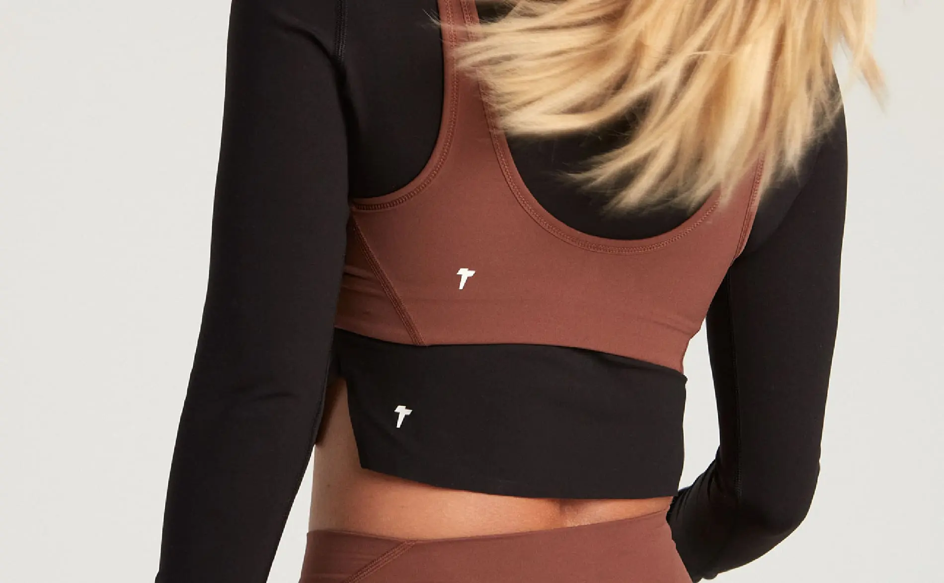
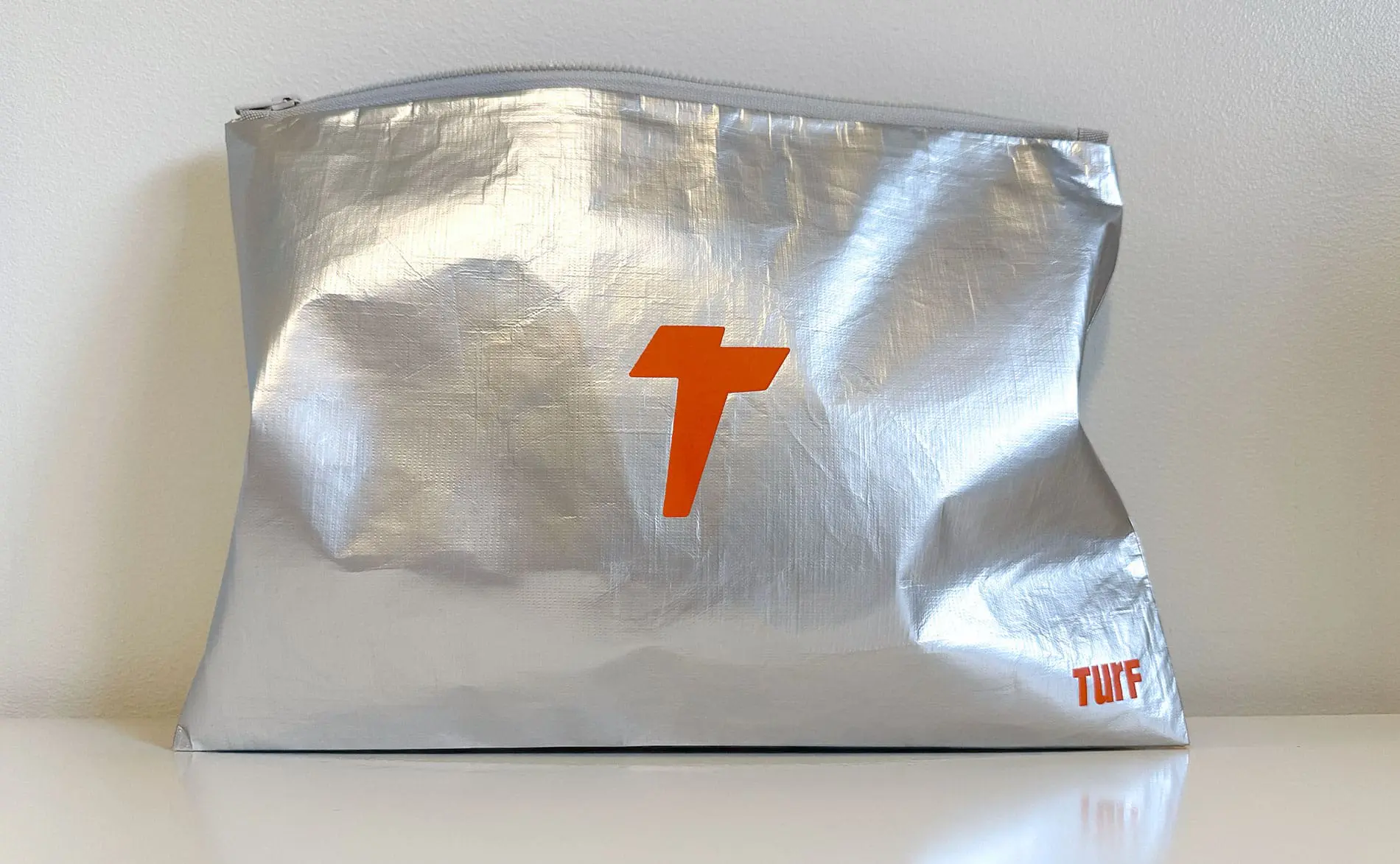
After a few iterations of looking at the mark in various contexts, we landed on the energized T icon that you see on the products today. On apparel, it will mostly be seen in neutrals, while online it mostly lives in a red-orange colour we call ‘flame’.
Working with Twin Fish Creative on the TurF brand refresh felt easy in the best way. Their branding expertise helped us land the new vibe we were after and made the process smooth and collaborative. Once we shared a few key goals, Sherry just got it — guiding us with the right questions and shaping our ideas into something we’re truly excited about.
– Deanne Schweitzer, TurF Founder and Co-owner
Brand Extension
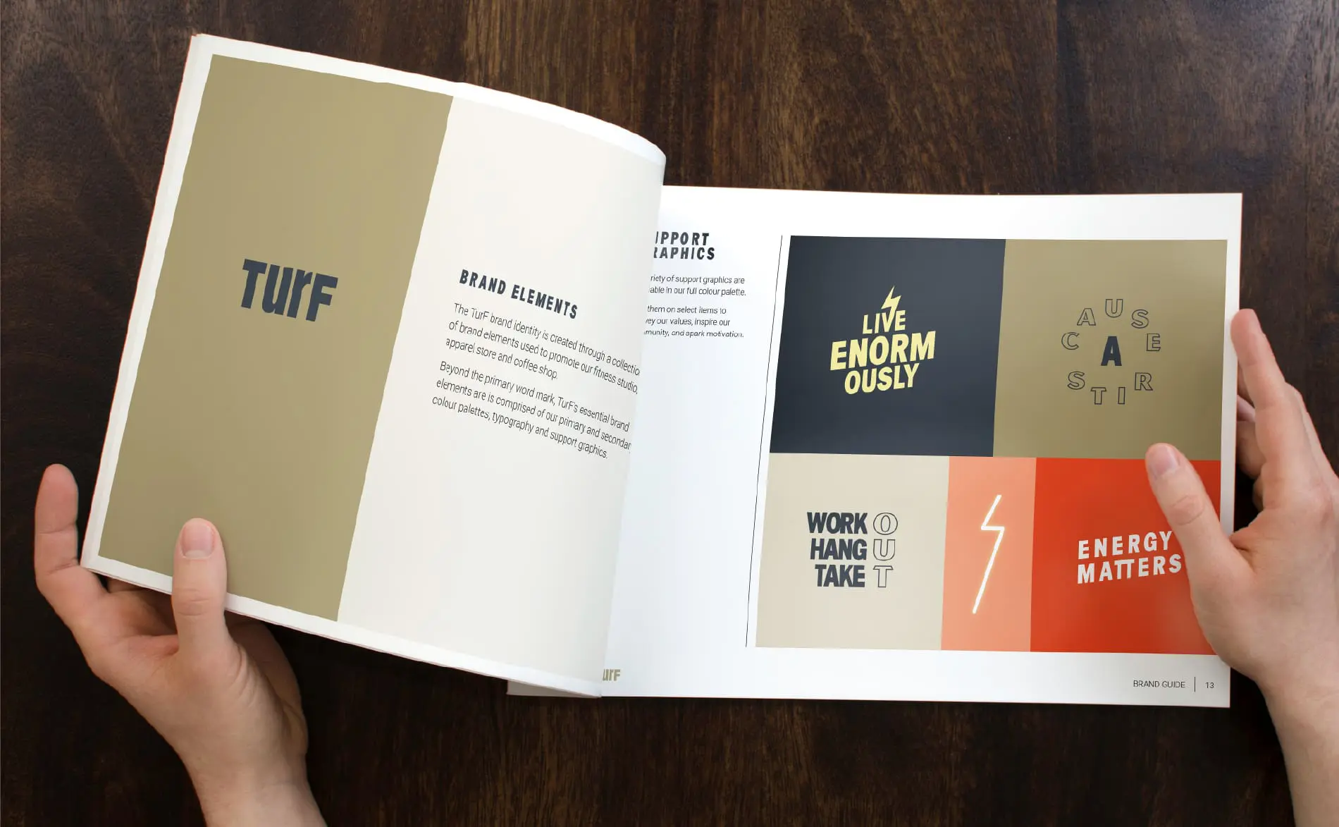
In addition to refining the primary and secondary colour palettes, we designed new support graphics to convey the values of the brand and to inspire and spark motivation in the TurF community.
A brand identity is much more than its logo, especially in today’s social environment. It’s a strategic investment to consider additional supporting graphics with a brand package that will allow you to extend your brand to add variety to your promotions and products, while maintaining a visually consistent image.
Results
Through an intuitive, collaborative process, we arrived at a very different place with the new TurF icon than what the client was originally expecting. Drawing inspiration from the mantra “Energy Matters” the new icon reflects the ripple effect of a positive mindset, good intentions, and the power of movement. All of which authentically represents the energy and experience at TurF.
Deanne Schweitzer, TurF Founder & Co-owner:
“Working with Twin Fish Creative on the TurF brand refresh felt easy in the best way. Their branding expertise helped us land the new vibe we were after and made the process smooth and collaborative. Once we shared a few key goals, Sherry just got it — guiding us with the right questions and shaping our ideas into something we’re truly excited about.
Having been part of the original founding team at Lululemon, I’ve learned a lot about what it takes to build a brand. Bringing Sherry in gave us a fresh perspective and real attention to the details, which helped us launch our new product line with brand assets that feel solid and intentional. Our new TurF Active T icon feels bold, modern, and completely aligned with where we’re headed. It feels like us — just more energized and ready for what’s next.”
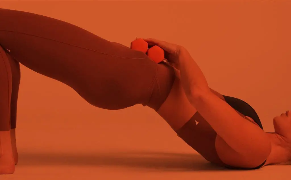
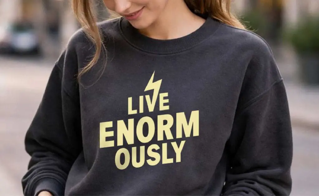
Activewear imagery generously provided by the client.